
What's the Difference Between Ivory and Cream Color?
Both are warm off-white tones, but ivory leans slightly more yellow while cream tends toward a richer, sometimes warmer or more golden undertone — the difference is subtle but visible side by side.
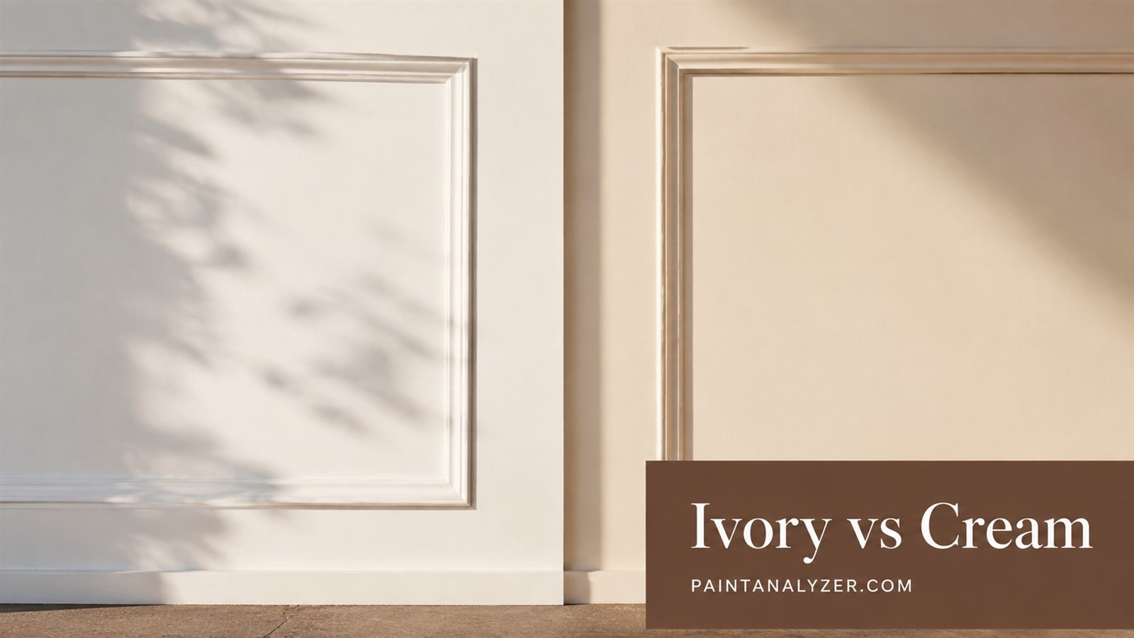
Ivory and cream are both popular warm off-white paint colors, and the difference between them is genuinely subtle — subtle enough that different manufacturers' specific "ivory" and "cream" products can vary and sometimes overlap, but there are some general characteristics that distinguish the two color families.
1. Ivory's general characteristics
Ivory typically leans toward a soft, pale yellow-white, named after the color of actual ivory material — it tends to read as a clean, slightly warm white rather than a distinctly golden or beige tone.
2. Cream's general characteristics
Cream tends to have a richer, sometimes slightly more golden or buttery undertone than ivory, named after the color of dairy cream — it can read as a bit warmer and deeper than ivory, depending on the specific formulation.
3. Why the exact difference varies by manufacturer
Since neither "ivory" nor "cream" is a strictly standardized color value, different paint manufacturers' specific products labeled with these names can vary meaningfully — checking the actual LRV and undertone of a specific product (following the LRV guidance) gives more precise information than relying on the name alone.
4. How they compare to true white
Both ivory and cream sit warmer and slightly darker than a true, neutral white, giving a softer, less stark appearance — this is part of their appeal for spaces where a pure white might feel too cold or clinical.
5. How lighting affects the perceived difference
Under warm artificial lighting, the subtle difference between ivory and cream can become less distinguishable, since warm lighting itself adds a yellow cast to any color — under cooler natural daylight, the difference is generally more visible, with cream's warmer undertone showing more distinctly against ivory's paler tone.
6. Testing both directly against each other before choosing
Given how close these colors are, testing actual paint samples of both side by side in the room's real lighting (rather than trying to judge from swatches alone or from memory) gives the clearest picture of which specific shade actually suits the space and coordinates with existing furnishings.
7. The practical takeaway
Both are warm, versatile off-white choices well-suited to a range of design styles — the choice between them comes down to a subtle preference for ivory's paler, cleaner warmth versus cream's richer, more golden depth, best confirmed with real samples rather than assumed from the names alone.
Guides are researched against primary documentation and observable evidence. Archived material is rewritten, checked, and substantially improved before publication.