
Choosing Paint Colors That Pair Well With Salmon, Burgundy, Walnut, and Taupe
Coordinating a wall color with an existing strong tone — furniture, cabinets, or carpet — comes down to a few reliable color theory principles that work across most specific color combinations.
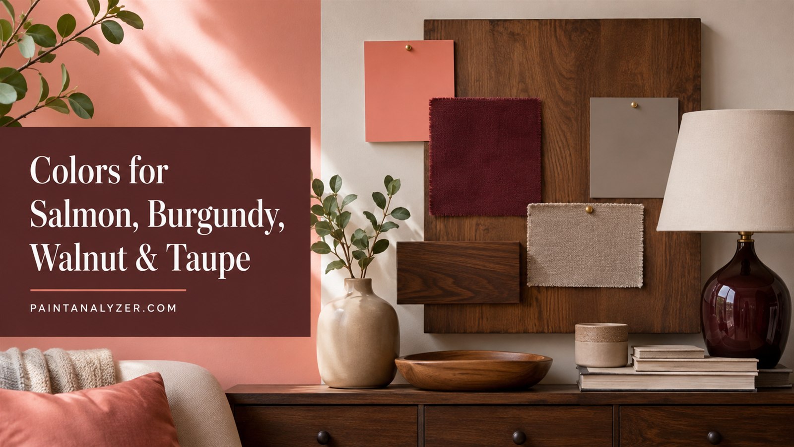
Choosing a wall color to pair with an existing strong color element — whether furniture, cabinetry, or carpet — comes down to a few reliable color theory principles that apply across most specific combinations, rather than needing a completely different approach for each individual color.
1. Color schemes that pair well with salmon
Salmon (a warm pink-orange tone) pairs well with soft neutrals like cream and warm white, which let salmon remain the focal color, as well as with complementary cooler tones like sage green or soft teal for a more contrasting, vibrant look — navy blue also creates a striking, sophisticated contrast against salmon's warmth.
2. Colors that coordinate well with burgundy
Burgundy (a deep red-wine tone) works well with warm neutrals like cream, tan, and gold, which complement its richness without competing with it, and also pairs strikingly with charcoal gray or black for a more dramatic, formal look — a soft blush pink can create an elegant, softer contrast against burgundy's depth.
3. Colors that go well with walnut cabinets
Walnut's warm, medium-to-dark brown tone pairs well with soft whites and creams for a bright, classic contrast, as well as with sage green or muted blue-gray for a more contemporary look — pairing walnut with another warm wood tone requires more care to avoid a mismatched, competing-brown effect, so leaning toward complementary wall colors rather than another distinct wood tone generally gives a cleaner result.
4. Timeless color options that pair with taupe
Taupe's neutral, warm-gray-brown versatility pairs well with almost any color, but classic combinations include crisp white trim for a clean, timeless contrast, soft blues or greens for a calming, coordinated look, and deeper charcoal or navy accents for added depth and sophistication in the same room.
5. What color paint pairs well with beige carpet
Beige carpet's warm neutral base pairs well with soft whites and creams for a light, airy look, warm terracotta or rust tones for a cohesive warm palette, and cooler blues or greens for a more deliberate, grounding contrast against the carpet's warmth.
6. General principles that apply across all of these combinations
Matching warm tones with warm tones (or cool with cool) generally creates a cohesive, harmonious look, while deliberately pairing warm with cool creates more visual contrast and interest — testing actual paint samples against the real existing color (fabric swatch, cabinet sample, carpet remnant) in the room's actual lighting gives more reliable results than judging color combinations from a screen or in a different room's lighting.
7. When to bring in a professional color consultant
For a significant investment (a full home's color scheme, an expensive existing element like custom cabinetry) where getting the color coordination right matters a great deal, a professional color consultant can offer more nuanced, trained guidance than general color pairing principles alone.
Guides are researched against primary documentation and observable evidence. Archived material is rewritten, checked, and substantially improved before publication.