
How to Mix Custom Paint Colors at Home: A Color-Mixing Guide
Every custom color comes back to the same primary-and-secondary color wheel logic — knowing which two or three base colors combine to create a target shade turns guesswork into a repeatable recipe.
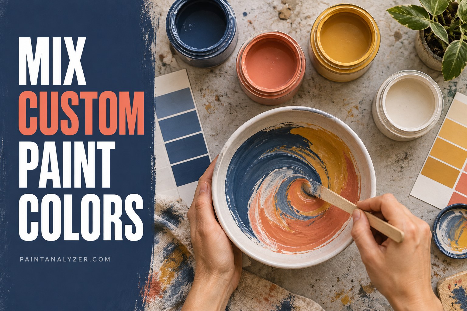
Every custom color below comes back to the same underlying color-wheel logic — knowing which primary and secondary colors combine to create a target hue turns what might otherwise feel like guesswork into a repeatable, adjustable recipe. As with any color mixing, test on a small sample first and let it dry before judging the final result, since color shifts somewhat as paint dries.
1. Beige
Start with white as the base, add a small amount of brown or a warm earth-tone (burnt sienna or raw umber), and adjust with a touch of yellow for a warmer beige or a touch of gray for a cooler one — beige is essentially a very light, desaturated brown, so small amounts of colorant go a long way.
2. Black
True black is most reliably achieved with an actual black pigment rather than mixing complementary colors — while combining all three primary colors (or a color and its complement) in the right proportions can approximate a dark, near-black tone, it typically comes out as a dark, slightly muddy brown or gray rather than a genuine rich black.
3. Gold
As covered for metallic paint specifically, a true gold requires actual metallic (mica-based) pigment mixed into a yellow-ochre or amber-tinted base — mixing yellow and brown alone produces a mustard or ochre color, not genuine gold's characteristic shimmer.
4. Hot pink
Mix red and white to create a base pink, then add a small amount of magenta or additional red until reaching the desired vibrancy — hot pink needs a higher concentration of red relative to white than a soft, pastel pink would.
5. Magenta
Combine red and blue in roughly equal parts, with slightly more red than blue, then adjust toward more blue for a cooler magenta or more red for a warmer one — magenta sits between red and purple on the color wheel, and small adjustments in the red-to-blue ratio shift it noticeably.
6. Navy blue
Start with blue and add a small amount of black (or a dark brown/purple as a gentler alternative to pure black) until reaching a deep, dark blue — adding too much black at once can push the color toward gray rather than a rich navy, so building up gradually works better than one large addition.
7. Neon colors
Standard color mixing generally can't produce a true neon/fluorescent effect — genuine neon colors require specific fluorescent pigments (sold as dedicated neon or fluorescent paint products) that react to UV light in a way standard pigments don't; mixing standard bright colors gets closer to "vivid" but not genuinely "neon."
8. Lime green
Mix yellow and green, with yellow as the dominant color, until reaching a bright, slightly yellow-leaning green — lime green sits closer to yellow on the color wheel than a standard green does, which is the key adjustment from a basic green mix.
9. Orange
Red and yellow combine directly to create orange — adjusting the ratio (more red for a deeper, more red-leaning orange; more yellow for a brighter, lighter orange) covers the full range from a subtle peach to a vivid orange.
10. Silver
As with gold, a genuine silver requires actual metallic (aluminum/mica) pigment mixed into a white or clear base — mixing gray alone produces a flat, non-reflective gray, not silver's characteristic shimmer and light reflection.
11. Tan
Similar to beige but generally slightly darker and more saturated — start with white, add brown, and adjust the ratio toward more brown than a beige mix would use, with a small amount of yellow or orange for warmth if a richer tan is wanted.
12. Teal
Combine blue and green with a small amount of white if a lighter teal is wanted — teal sits between blue and green, and adjusting the blue-to-green ratio shifts it toward a more blue-leaning or more green-leaning result.
13. General principles across every color above
- Add colorant gradually — it's much easier to add more color than to correct an over-tinted batch.
- Mix a large enough batch at once — matching a custom color exactly a second time is genuinely difficult without a recorded ratio.
- Record the recipe — noting the exact ratio used (by volume or drop count) makes the color reproducible later.
- Let it dry before judging — as covered for paint drying darker or lighter generally, the wet color isn't the final answer.
Guides are researched against primary documentation and observable evidence. Archived material is rewritten, checked, and substantially improved before publication.